8.9 浮动 九宫格
本文共 4078 字,大约阅读时间需要 13 分钟。
【经典题】
使用HTML+CSS实现如图布局,border-width:5px,格子大小是50px*50px。hover在这里插入图片描述时边框变成红色,需要考虑语义化。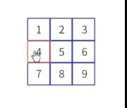 (1)首先想借用506具中模型和605浮动模型去实现该问题,感觉因为基础知识不牢固,所以没走通。以后再尝试。 尝试成功:
123456789
*{ margin:0; padding:0; color: #424242; font-family:Arial;}.wrapper{ width: 100px; height: 100px;}.box{ width: 30px; height: 30px; border:solid blue 2px; float: left; margin-bottom: -1px; margin-left: -1px; margin-right: -1px; display: inline-block; /*有没有影响不大*/ line-height: 30px; text-align: center;}.box::after{ content: ''; display: block; clear: both;}.box:hover{ border-color: #f40; position: relative;} (2)再联想到天猫导航栏的实例,再次尝试,先写天猫导航栏:
*{ margin: 0px; padding: 0px; color: #424242; font-family: Arial;}a{ text-decoration: none;}.nav{ list-style: none;}/*去掉li前面的点或者其他图案*/.nav .list-item{ /*父子选择器需要有空格,不然实现不了*/ float: left; margin:0 10px; height:30px; line-height:30px; /*保证文字居中*/}.nav::after{ /*用完浮动后清除浮动*/ content: ''; display: block; clear: both;}.nav .list-item a{ /*a标签*/ padding: 0 5px; color: #f40; font-weight:bold; height: 30px; display: inline-block; /*按照元素的宽度占据空间,不会独占一行。*/ border-radius: 40%;}.nav .list-item a:hover{ background-color: #f40; color: #fff;} (3)借助天猫导航栏的案例实现了类似的效果,但是边框不是很像,效果如下图,接着微调,并且尝试用多种方法去实现

*{ margin: 0px; padding: 0px; color: #424242; font-family: Arial;}a{ text-decoration: none;}.nav{ list-style: none;}/*去掉li前面的点或者其他图案*/.wrapper{ width:100px; height: 100px;}.nav .list-item{ /*父子选择器需要有空格,不然实现不了*/ float: left; margin:0 5px; height:30px; line-height:30px; border:solid black 1px; /*保证文字居中*/}.nav::after{ /*用完浮动后清除浮动*/ content: ''; display: block; clear: both;}.nav .list-item{ /*a标签*/ padding: 0 5px; font-weight:bold; height: 30px; display: inline-block; /*按照元素的宽度占据空间,不会独占一行。*/ border-radius: 40%;}.nav .list-item:hover{ border-color: #f40; /*color: #fff;*/} (4)继续微调css:
*{ margin: 0px; padding: 0px; color: #424242; font-family: Arial;}a{ text-decoration: none;}.nav{ list-style: none;}/*去掉li前面的点或者其他图案*/.wrapper{ width:100px; height: 100px;}.nav .list-item{ /*父子选择器需要有空格,不然实现不了*/ float: left; border:solid black 3px; font-weight:bold; height: 30px; width: 30px;; margin-bottom: -3px; margin-right: -3px; line-height: 30px; text-align: center; /*后两行保证文字居中*/}.nav::after{ /*用完浮动后清除浮动*/ content: ''; display: block; clear: both;}.nav .list-item:hover{ border-color: #f40; position: relative; /*relative保证每个元素的四个角的hover都会实现*/} ok,用relative和margin缩进实现了,

(5)接着用outline实现以下试试:
原理:把父级元素背景色设为蓝色,上面的子元素背景色设为白色,设置margin值,让子元素之间留有底层父元素的背景色,然后再通过outline属性,设置子元素的hover效果。
.wrapper{ width:100px; height: 100px; background-color: #00f;}.nav .list-item{ /*父子选择器需要有空格,不然实现不了*/ float: left; border:solid black 1px; font-weight:bold; height: 30px; width: 30px; background-color: #fff; margin-left: 1px; margin-top: 1px; line-height: 30px; text-align: center; margin-top: 1px; /*后两行保证文字居中*/}.nav::after{ /*用完浮动后清除浮动*/ content: ''; display: block; clear: both;}.nav .list-item:hover{ outline:solid #f40 3px; position: relative;} (6)也可以直接尝试用最笨的方法——绝对定位去实现
转载地址:http://catzi.baihongyu.com/
你可能感兴趣的文章
(十) Web与企业应用中的连接管理
查看>>
(八) 正则表达式
查看>>
一.JavaScript 基础
查看>>
7.ECMAScript 继承
查看>>
HTML DOM
查看>>
AJAX 基础
查看>>
JSON 基础
查看>>
J2EE监听器Listener接口大全[转]
查看>>
cookie、session、sessionid 与jsessionid[转]
查看>>
常见Oracle HINT的用法
查看>>
JAVA中各类CACHE机制实现的比较 [转]
查看>>
PL/SQL Developer技巧
查看>>
3-python之PyCharm如何新建项目
查看>>
15-python之while循环嵌套应用场景
查看>>
17-python之for循环
查看>>
18-python之while循环,for循环与else的配合
查看>>
19-python之字符串简单介绍
查看>>
20-python之切片详细介绍
查看>>
P24-c++类继承-01详细的例子演示继承的好处
查看>>
P8-c++对象和类-01默认构造函数详解
查看>>